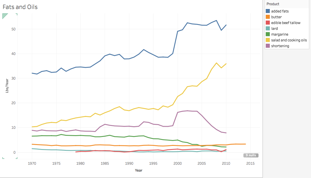
This graph shows the trends of per capita availability of fats and oils over time. As you can see almost all of these forms of fats and oils have increased from 1970 to 2010. The exception to this is shortening which faced a sharp increase around 1998 and then slowly decreased from 2000 to 2010. Margarine consumption has also slowly decreased over time, but not drastically. One major component of this graph is the large value of added fats over the years. This is most likely due to the fact that most of our food is becoming very processed, and added fats are being added to increase flavor and overall consumption. Overall, the per capita availability of fats and oils has increased over time.
